The Golang Saga: A Coder’s Journey There and Back Again. Part 3: The Graphing Conundrum
Welcome back to the third part of “The Golang Saga: A Coder’s Journey There and Back Again.” In the first part of this series, I started work on a personal project, the Climate Change Visualizer, using Go as my chosen programming language. In the second part, we delved into a data expedition, exploring available data formats and filters in CDO. Now, it’s time to take a deeper dive into visualization. In this chapter, I will focus on creating graphs in Go using the CDO data for Tel Aviv, spanning from 1939 to 2023. We’ll explore various techniques to illustrate climate change patterns effectively.
As a quick reminder, in the previous article we’ve selected the following charts to illustrate climate change patterns:
- Scatter plot that illustrates how the minimum and maximum temperatures change throughout the years on average.
- Heatmap visualizing yearly average temperatures.
- Temperature anomaly graph that shows average temperature variations throughout years, comparing them to the chosen baseline.
- Climate change stripes that uses colored stripes to represent each year’s average temperature.
Let’s continue this coding adventure and explore the world of visualizations with Go! All the code used in this article can be found in this repository.
Chapter where the main character discovers that the world of data is not perfect
Before diving into the visualization process, let’s revisit the data we downloaded for Tel Aviv. As a quick reminder, the CSV looks like this:
Additionally, I copied a sample of data from another station in this CSV file:
As we recall from the second article, we requested daily temperature records from four different stations. However, even from those few rows, we can observe that some data is missing, indicated by the empty values in the TAVG, TMAX, and TMIN columns. This raises the possibility that there might be more missing values in the dataset.

To gain a better understanding of the missing data, our next step is to create a graph that visualizes the overall situation. I believe a grouped bar chart per station, with the sum of empty values for TAVG, TMAX, and TMIN as the values, would be a suitable choice for this purpose.
To build the plots in this article, I’ll be using the gonum/plot library, which provides a range of tools for generating different types of charts and graphs. While I’m new to gonum/plot, I believe it has the potential to effectively showcase temperature trends and patterns over time.
You can get gonum/plot using the following command in your terminal:
go get gonum.org/v1/plot/...As a quick reminder, in the previous article I created a Jupyter notebook with Go kernel where I read the CSV file and stored the data in the cache. Now, I can use the cached csv_records variable in other cells of this notebook, which allows easier data manipulation and visualization without having to reload the data each time.
Now, my next task is to calculate the number of empty TAVG, TMAX, and TMIN values in the CSV file. While working on the code, I had the opportunity to explore and understand the map data type in Go. Let’s take a closer look at the code below:
As you can see, I defined a data structure called StationData, which represents information about a weather station, including its name and the number of missing values for TAVG (average temperature), TMAX (maximum temperature), and TMIN (minimum temperature) data.
Then I created a function called count_missing_data, which takes a two-dimensional slice of strings (data) representing the weather records. Inside this function, I used a map (stationMap) to store the StationData objects for each unique station name.
Next, I looped through each record in the CSV data and extracted the station name. Then, I counted the number of missing values for TAVG, TMAX, and TMIN in each record and updated the corresponding fields in the StationData object.
As a result, I have stations_counts variable in the cache, showing the number of missing TAVG, TMAX, and TMIN values for each weather station:
[{ISE00100468 3521 198 201} {IS000002011 3560 45 45} {ISE00105694 6478 96 375} {ISM00040180 0 2202 4735}]And with this map now we are ready to create a group bar chart for each station to find out which station is the best for each type of value. I found a helpful tutorial on gonum/plot, so I’m going to use plotter.NewBarChart for my purposes.
In the code above, I set up three groups, groupA, groupB, and groupC, to store the counts for each station's missing TAVG, TMAX, and TMIN values, respectively. Then I created three bar charts with different colors, barsA, barsB, and barsC, for the three groups of data. I added those three bar charts to the plot p.
The last part of the code is responsible for rendering the plot as a PNG image and showing it directly in Jupyter Notebook. It uses Gonum/Plot’s WriterTo method to generate the image and then displays it using the gonbui.DisplayPNG function.
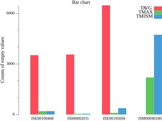
From the graph above, we can see that station ISM00040180 has the best data availability for TAVG values (red bar is almost invisible), but not as good for TMAX and TMIN values. On the other hand, other stations show the opposite pattern, with better data for TMAX (green bar) and TMIN (blue bar), but less for TAVG.
At that point, I was focused solely on checking for empty values in the dataset. However, there might be additional challenges, such as completely missing days of data.
To get an overall view of the situation, I decided to create a cross table spanning from 1940 to 2022. This table displays the years on the left side and indicates the percentage of existing TAVG, TMAX, and TMIN values relative to the total number of days in each year (366 days for leap years).
In this code below, I created a data structure called StationYearData to store the count of existing TAVG, TMAX, and TMIN values, as well as the total number of days for each year and station combination. Then I calculated those numbers and stored them in the stationsData map, which is organized by station and year.
Next, I extracted all unique years and stations from the stationsData map to create the headers for the cross table. I sorted the stations and years to ensure consistent order in the table and wrote the results to output.csv file.
As you can see from the result table below, our analysis revealed that stations IS000002011 and ISE00100468 have missing data for the entire range of recent years. This suggests that these stations might have stopped taking measurements during that period.
We can conclude that the data from the ISM00040180 station is suitable for creating visualizations based on average temperature. On the other hand, the data from the ISE00105694 station can be used as a source for visualizations related to maximum and minimum temperatures.
Generally speaking, in the future, we will need to take into account that not all data may be available, and we may need to find ways to fill in the missing values. However, for now, we will leave it as it is.

Chapter where the main character becomes frustrated
Finally, let’s have some fun! We have our data in csv_records variable in the cache, let’s install all Go modules for visualization:
go get gonum.org/v1/plot
go get gonum.org/v1/plot/plotter
go get gonum.org/v1/plot/vg
go get gonum.org/v1/plot/plotutil
Scatter plot
For scatter plot that illustrates how the minimum and maximum temperatures change throughout the years on average we need to calculate average minimum and average maximum temperature per year for a chosen station ISE00105694. I’m going to use plotter.NewScatter from the tutorial to draw the graph.
In the code below, I created yearlySummary map, where each key represents a year, and the corresponding value is a TempSummary struct containing the total TMAX and TMIN values for that year, as well as the count of recorded temperatures. Then iterating over the yearlySummary map, I calculated the average TMAX and TMIN temperatures by dividing the total TMAX and TMIN values by the count of recorded temperatures for that year.
For each year, I set the X-coordinate of the i-th data point in scatterData to the calculated tmaxAvg, and the Y-coordinate to the calculated tminAvg. Then plotter.NewScatter() uses this data to create the scatter plot.
Let’s take a look at the scatter plot below. Frankly, it doesn’t look very impressive.
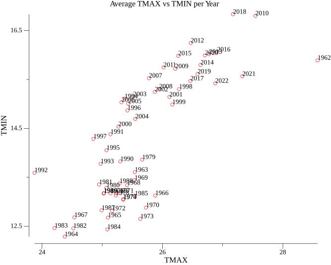
To be honest, finding information on visualizing graphs in the Go language is quite challenging, and the data available to ChatGPT about gonum.org/v1/plot module is outdated, which makes it difficult to create visually appealing graphs. However, luck was on my side, as I stumbled upon an example of a colored scatter plot that looked quite nice.
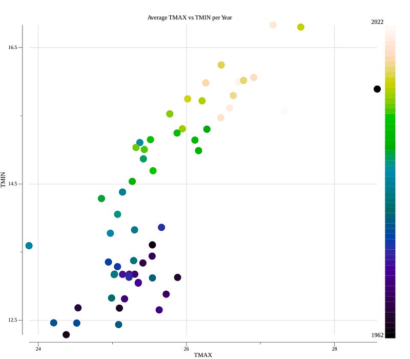
Let’s look at the new code. In this code, I specified the style and color for individual points in the scatter plot. The function sc.GlyphStyleFunc takes an index i as input and returns a draw.GlyphStyle that defines the appearance of the point at that index.
To determine the color of the point, the code calculates a normalized value d based on the z-coordinate of the point (z) and the minimum (minZ) and maximum (maxZ) z-values in the scatter data. It then uses this normalized value to interpolate between the colors defined in the colors colormap.
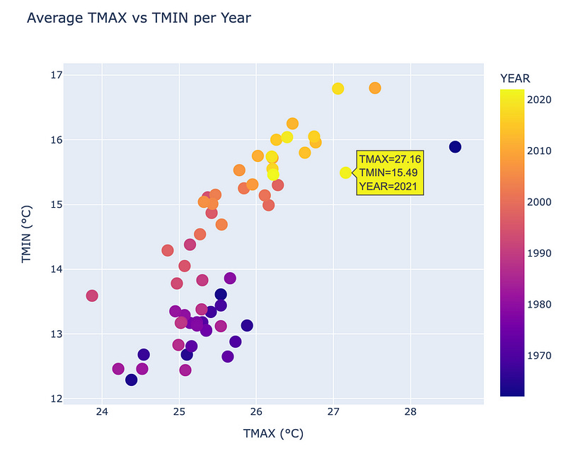
The new chart looks much better, and we can observe a warming trend over the years based on the colors of the dots.
Heatmap
I couldn’t find a heatmap function in plot module so I asked ChatGTP for a help.

You’re not helping, ChatGPT.
But then I found this article, and by following the provided example, I managed to create my own heatmap.
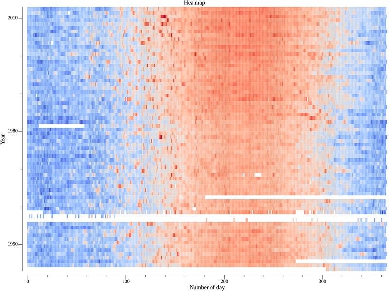
So what is a heatmap? A heatmap of average temperatures is a graphical representation that uses colors to show the average temperature values across a geographical area or a specific grid. Warmer colors, such as red or orange, typically represent higher average temperatures, while cooler colors, like blue or green, represent lower average temperatures.
To create the graph, we first need to obtain the average temperatures per day of the each year and then adjust the colors accordingly.
The code below defines a custom struct called plottable, which holds the data needed to create the heatmap. The WeatherData struct represents the weather data for a specific station, including temperature measurements (Tavg, Tmax, and Tmin) and other information.
I read data from the csv_records variable and filter it to get the temperature data for the ISM00040180 station. The dataset variable is a two-dimensional Go slice that holds the average temperature data for each day of the year (rows) across different years (columns). Then I find only non-empty years (columns) and use moreland.SmoothBlueRed() function to create a color palette for the heatmap.
The result has empty lines due to the presence of empty or missing values in the CSV dataset, as I mentioned earlier during data analysis. In the future, we may need to decide whether to ignore these gaps or implement techniques to fill in missing data, such as using the nearest neighbor approach. Despite the empty lines, the graph clearly shows the expansion of the red funnel during the summer over the years from the bottom to the top. This observation indicates a warming trend over time.
Temperature anomaly graph
For this graph, we should start with defining and calculating baseline. I chose 1951–1980 years as a baseline period because Internet said that it’s the most common choice in my case. To calculate average temperature for the baseline period we need to add up the temperatures for each year within the selected time period and divide the total by the number of years. This average will be used as the reference point for comparing temperatures in subsequent years.
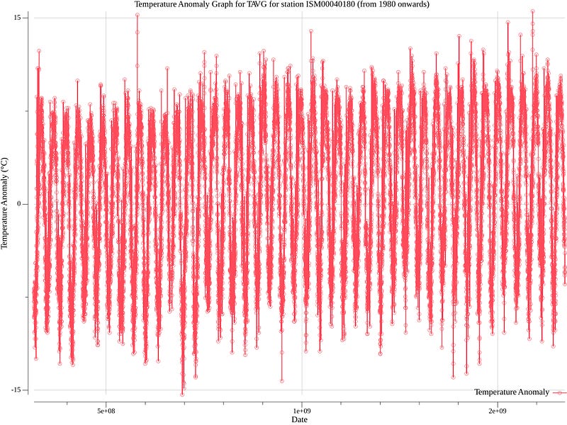
To plot the graph, we will calculate the temperature anomalies for each year by subtracting the baseline (average temperature) from the actual temperature for that year. Positive anomalies indicate temperatures above the baseline, while negative anomalies indicate temperatures below the baseline.
In the following code, I iterated through the CSV records, filtering and parsing the TAVG temperature data for the ISM00040180 station between 1951 and 1980. Within this process, I calculated the sum of TAVG values and counted the number of valid records within the baseline period. By dividing the baselineSum by the baselineCount, I obtained the baseline value.
Then, subsequently, I calculated temperature anomalies for each TAVG value in the data slice, starting from 1980, by subtracting the baseline value. Finally, I used the plotutil.AddLinePoints function to create and visualize the graph.
The result is visually less appealing than I expected. Despite my efforts, I couldn’t find a way to remove or resize those points, which has negatively affected the graph’s aesthetics. As a result, it doesn’t look as clean and smooth as I had hoped. However, even with these issues, one can still observe the overall trend of rising temperatures over the years.
Climate Change Stripes
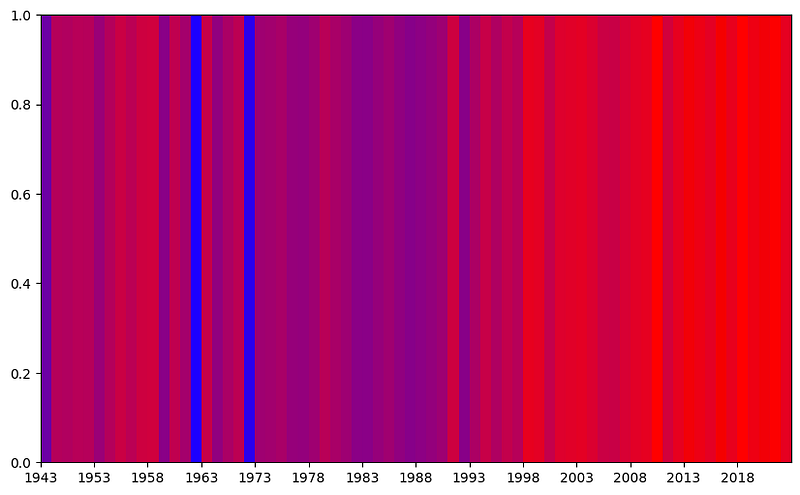
This graph consists of colored stripes representing average temperature data for each year. Each stripe corresponds to a specific year, and the color intensity shows how warm or cool that year was. Warmer years are depicted with warmer colors like red, while cooler years are shown with cooler colors like blue.
I started with the question to ChatGPT of whether it’s possible to do it.
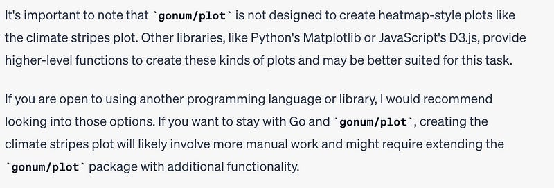
So Climate Change Stripes seems like a colored bar chart to me, and I asked if it’s possible to create it, to which the answer is no:
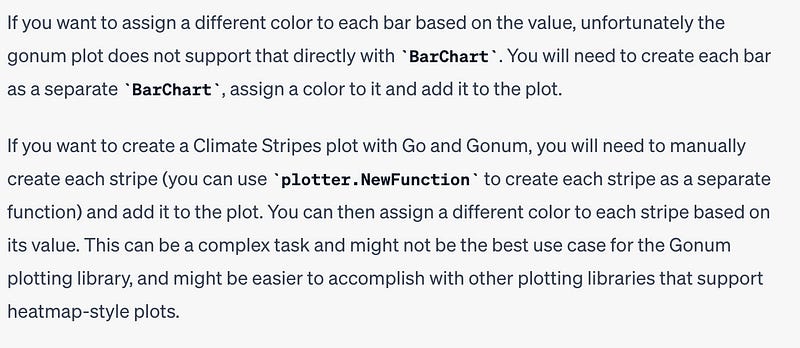
By this point, I had become quite frustrated with Go’s limited graphical capabilities and the extensive code needed to produce a basic graph. Consequently, I made the decision to give up on trying to create this particular graph in Go. While you can find the code responsible for calculating the graph’s data in my repository, I wasn’t able to successfully generate the graph using Go’s capabilities.

Chapter where the main character calls Python for help
To put it simply, I must admit that the graphs I created in Go didn’t turn out well. It seems that Go is not the best tool for making nice-looking visualizations. So, let’s look for another superhero that can handle visualization tasks more effectively and beautifully.
All the code mentioned below and more you can find in this Jupyter file in my repo.
For this chapter we need to install Python and a few libraries:
pip install pandas
pip install seaborn
pip install matplotlib
pip install numpy
First, we read csv into pandas dataframe:
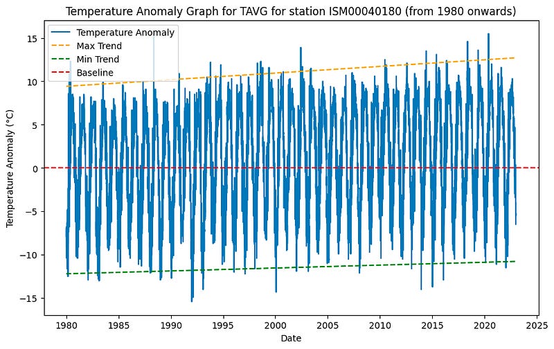
Let’s revisit the anomaly graph because I feel like I didn’t prove that this graph shows any trend.
In the code below, I replicated the same process of calculating the baseline by averaging the TAVG values for the period 1951–1980, and then calculating the temperature anomalies by subtracting the baseline value from each TAVG value in the data slice. Additionally, I included two lines to visually represent the trend in anomalies, allowing us to better observe any temperature changes over the years.
Now, with the yellow and green lines, we can clearly observe the warming trend in the temperature anomalies. These lines help us better visualize any changes in temperature over the years comparing to the baseline period.
Well, it’s time to conquer climate change stripes graph.
In this code, the data is filtered to focus on the ISM00040180 weather station. Subsequently, I grouped the data by year, and created a list for each year, containing the TAVG values. By calculating the annual mean temperatures and normalizing them to the [0, 1] range, I mapped the mean temperatures to colors. The code produces a Climate Change Stripes effect by drawing stripes for each year, where the color of each stripe represents the normalized mean temperature for that particular year.
As a result, we finally witness a clear warming trend presented in a visually striking and beautiful chart. The chart shows a significant increase in the red coloration after the year 1998, emphasizing the pronounced warming trend over the years.
Even in simple Python modules like Matplotlib the job is accomplished exceptionally well. If we use a more sophisticated library for data visualization, such as Plotly, we can achieve even more advanced and interactive visualizations. Let’s see an example for our first scatter plot graph.
First, we should to install Plotly library.
pip install plotlyWith the following code, we can create a professionally looking scatter plot using plotly.express.scatter. This scatter plot allows us to interact with the data by hovering the cursor over a point and getting its corresponding values of TMAX and TMIN
Actually I even found a repo with wrapper functions for Plotly’s HTTP API on Go. It might be helpful in the future.
Chapter where the main character sees light at the end of the tunnel
Taking into account my difficulties with using Go for graph visualization, I consider the following structure for my Proof of Concept (POC).
- A robust database to store historical weather data from the CDO (Climate Data Online) source.
- An intuitive frontend application that can construct climate graphs using the weather data.
- An API application that will serve data from the database to the frontend app upon request.
- A data transformation and aggregation app (ETL) that will fetch data from the CDO API, process and organize it, and finally load it into the database for easy access and retrieval by the frontend app.
For the POC, I will set up a local environment using Docker containers. We’ll start with a container hosting Jupyter and facilitates the creation of climate graphs using Python and Plotly. This will serve as our frontend application.
On the backend, we’ll develop an API application on Go, another Docker container that will connect to our chosen database. The API will be the bridge between the frontend and the database, serving the weather data upon request and ensuring smooth data flow for the graph generation.
The final piece of the puzzle is an essential component — the data transformation and aggregation app (ETL). Implemented in Go, this container will fetch data from the Climate Data Online (CDO) API, process and organize it, and efficiently load it into the database. This ETL process will keep our database up-to-date with the latest weather data, ensuring our visualizations are always current.
I’m still deciding on the database, but I’m considering using PostgreSQL. However, I’m open to suggestions and would love to hear your thoughts in the comments.
Thus, this setup not only makes our system easy to run, but also makes it portable — it can be run on any machine with Docker installed, without needing to worry about installing dependencies.
Additionally, this architecture is flexible and future-proof. If we wanted to replace our Jupyter notebook with a different frontend, like a React app, we could do so without affecting the rest of the system. Similarly, if we wanted to switch to a different DBMS, we could replace our container with a different database container, update our Go applications to interact with the new database, and leave the rest of the system untouched.
Despite the challenges, I am generally satisfied with the progress I have made on this journey.

Conclusion
To sum up, in this chapter we’ve faced challenges and found solutions in visualizing climate data. In addition, we have outlined the key aspects of our Proof of Concept (POC).
Stay tuned for further progress and new insights as we continue our adventure with Golang.
Previous articles:


